Negative space as a design principle
I never like to play favourites but one of the best designery ways to love on your customer is negative space! Also sometimes called white space or clear space, negative space is always your friend.
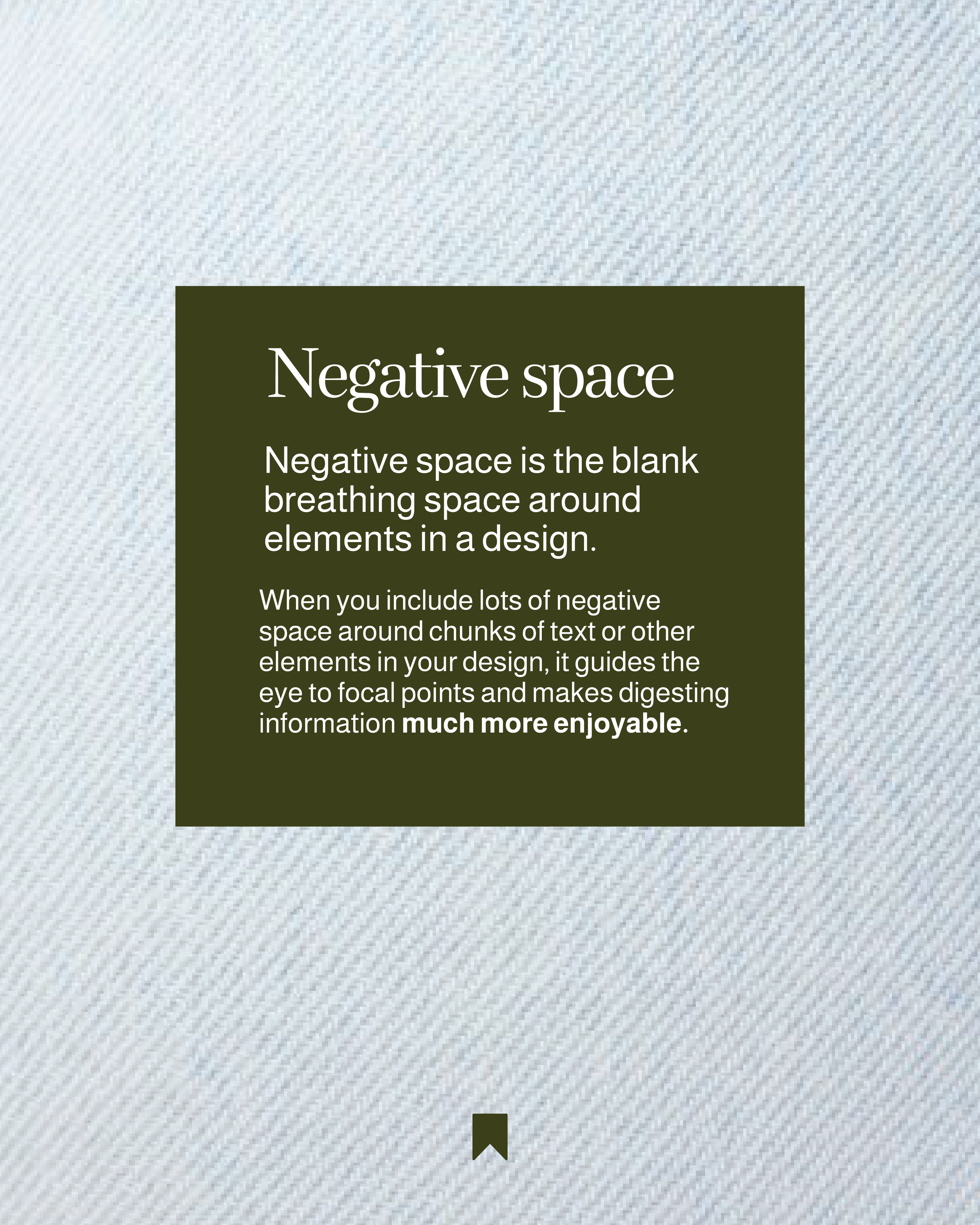
So next time you are almost finished designing something for social media or for your business documents, ask the question: is there enough negative space?
Am I giving the most important elements enough breathing space so they can be digested really easily and well?
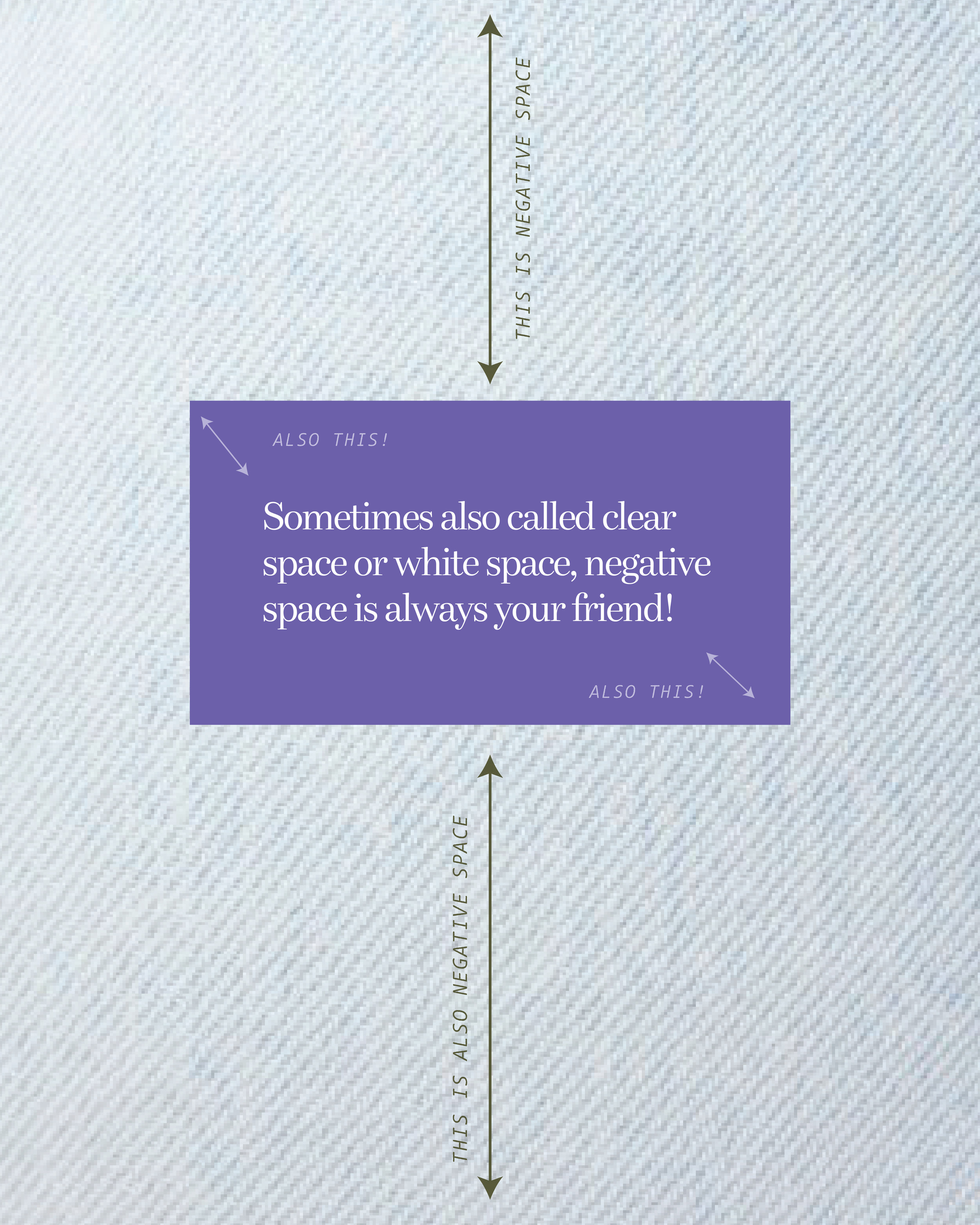
If not, find some ways to add in more negative space. This might mean deleting some things that are less important, or reducing the size of the text so it has some clear space around it.